Monday, March 30, 2015
Friday, May 2, 2014
Final Train Depot Design - Commercial and Residential
This project was a project based on Historic Restoration of a Train Depot located in Pullman, Washington, which is to be transformed into a residential space for an artist along with his/her spouse, while incorporating an art gallery and art studio for which the artist can work. Along with the designs, I was supposed to stick to the criteria of ADA and universal design as the commercial portions must be ADA accessible and the residence will be for one legally blind occupant, the husband/wife. The project was meant to be a part of an adaptive reuse design with using the historic train depot's original exterior walls with little to no alterations to windows and doors and using some features within the depot for the new design. The train depot design process was a long and extensive project which taught me a lot about commercial and residential design that I had not learned before while applying the concept of historic restoration and adaptive reuse. My initial project was inspired by a nail in the wall of the exterior of the depot, which in end inspired the concept of Organic Vs. Synthetic Design.
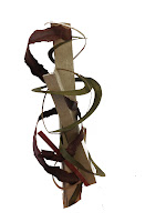

The initial tour of the depot was in itself inspiring, however, I felt that every object I looked to for inspiration was either the same as someone else's (taking away from the originality) or not intriguing enough for me to build off of in a non literal way. This is why I decided to go back to the depot on my own on the following day. When visiting on my own, I walked the entire depot with no distractions and found this old rusty nail in the side of the building. The nail began to make me think and wonder about the depot in ways I had not before, focusing on the history and the meaning rather than the design and materiality. This told me that the nail was my inspiration object. Taking multiple photographs of the nail, I ended up choosing the photo above as my inspiration due to the emphasis of the photo on the nail pulling in a viewer. Through building my concept, I ran into a lot of complications with my thought process and not being too literal. With that, I began to think outside of the literal design of the nail and brick and the texture of the materials and into the actual concept of the nail itself as I had in the beginning. Thinking more about what the nail means and why it is there, is how I came up with my design concept. Looking into the history, meaning, wonder, and stories of the nail and who was there, what hung upon it, why it was there, etc was what drove me into the concept of history and wonder but also the idea that it had been there so long that the organic matter around it has literally wrapped itself around the nail, which is the synthetic. This essential brought about my title of the Synthetic vs. Organic Design. This initially led to the design of my parti, textile, and concpept model. (all on previous blog, and above)
In order to preserve the historical aspect of the original train depot, I was to include and remain all exterior walls that were previously there and all windows and doors could only be interchanged as one or the other and not taken away. With this, I kept most windows the same and only changed one to a door and then one double door to a single and a window. Also, for the exterior of the gallery, I changed the doors to double out swinging doors to meet code for commercial egress. Along with my designing of the exterior with walls and door changes, I basically took on the challenge of a landscape architect and designed the exterior foliage of the depot as well. Adding in plants, trees, walkways, and more which follow my concept as well as egress for the commercial and residential design. The Site Plan pictured shows the walkways in which the gallery egress allows emergency access to the parking lots as well as the residential entry pathways. The back of the residential design allows for a private access back yard that even with the path from the gallery interrupting, is blocked with fencing to allow privacy. It was a challenge for me to channel a landscape design from my interior safeplace, but it was actually very fun and interesting to add to the exterior with this design and not remain only designing the interior. My overall exterior design followed codes and inspiration with its overall organization, using the synthetic vs organic in the grass vs brick and concrete swirling pathways.
Overall, my favorite part of designing the train depot was working on the Art Gallery and the Stir Competition. It was a nice adjustment to venture into commercial design versus the residential design that we have been working on for so long now in the Interior Design courses. using codes and ADA in ways which I have not had to before was a challenge in the beginning, but essentially I figured it out (seen in the photo below). When designing the gallery, it was fun to bring in my concept in mostly the ceiling to allow large concept inspiration but without overpowering the artist's artwork throughout the gallery itself. I was able to bring in organic shape and the piecing of the straight and harsh synthetic into the ceiling with the dropped features and clouds throughout. On top of the design aspects themselves, I am also very proud of the perspectives that I drew for these designs. With the artist that I ended up choosing for inspiration, the art is very vibrant colored and smaller in scale, this is why I chose grey walls to avoid taking from the light absorption that the paintings will need to stand out but also why I lowered the ceilings significantly to not overwhelm the unused wall space in the interior all together. The artist's art is inspired by himself and his own history, I thought this was relevant to my concept initially resulting in the name of the gallery as "His Story Art Gallery" referencing the art as a way to tell his own story but also the history of the nail and depot in all. Overall, my gallery design is my favorite part of the entire Train Depot design as it pulls in the history, emphasis, contrast, and organic vs synthetic inspiration while sticking to the historic restoration guidelines given.
In contrast to my favorite part of the design, the Codes and Egress and the Demolition plan were my least favorite due to how challenging it was overall. I am not saying that I did not like learning it in the end, because in the end it was very significant and influential to my design and also to further designs, it was just a challenging process as I have not done either type of plan before. Learning how to make a codes and egress plan was a lot more work than I intended, requiring hours of research and thinking of how to plan a space accordingly but also remembering those guidelines while planning the space. The overall learning process I feel was a very important aspect to this design project and it will help me in further designs throughout my education as well as my career. Though the process was a challenge, I feel that I adequately met the criteria and learned a lot in the process. It was interesting to think of the design as more than aesthetic and unintentional (in reason to walls etc) and to be able to look as where to tear down and apply new walls with consideration to the entire building, water walls, etc. In order to accommodate sustainability, with this demolition plan, I kept water walls and reused them throughout the design and multiple other walls as well. I also used space efficiently in terms of egress and circulation. I feel that learning codes and demolition and the more on the complicated and intricate design parts instead of on the aesthetic and artistic side of the design process is essential to learning the trade of interior design and this project allowed me to do so.
Presentations were an essential part to the project in the end as it was our way of telling the entire story. I am pretty confident in my graphic design abilities, however, in this project I seemed to run into a wall and I was stuck for awhile on how to compositionally layout the project for showing to professionals, etc. With time, I figured it out through exploration and was very proud of the graphic elements and presentation that I came up with, however, the challenge was a new thing to me. I usually do not come up with a block for graphically representing my work, as I did with this project, I had to overcome it and learn new ways of dealing with the problem which taught me a lot about patience and simplifying. I say simplifying because I realized that I hit the block because I had too much going on in my head for ideas with integrating my concept in the graphic orientation of my final boards. With sitting down and working it out in thumbnails, I was able to come up with a graphically pleasing concept to my boards without overwhelming the project or distracting from the depot design itself. In the end, I felt very proud and confident in my boards when going into presenting because I was able to overcome this obstacle, but also to practice and rehearse my presentation in order to adequately sell my design to the viewers. Receiving reviews from the professionals is one of my favorite parts as it gives me things to grow from, learn from, and work on for next time but also reassures my designs and again helps to solidify that I am proud of what I have been working on for several months.
In the end, the Train Depot Historic Restoration and Adaptive Reuse project was very beneficial to learning new design techniques and growing as an interior designer overall. I feel that I learned a lot about myself, concept, and codes from this project which I can take with me in the future for other designs. This project was fun yet exhausting at the same time, but I wouldn't change anything about that as it was a great learning experience. In end, I feel that I was able to clearly represent my inspiration throughout my project and reflect on the codes and universal design requirements with the final project completed.
Wednesday, April 16, 2014
Stir Competition Submission
Friday, February 28, 2014
Blind Audition
Tuesday, February 25, 2014
Concept Development - Train Depot Adaptive Reuse
FINAL PARTI
TEXTILE DESIGN
FINAL MODEL OF INSPIRATION
Tuesday, February 11, 2014
Monday, February 10, 2014
Case Study - Architect of 1890-1930
Tuesday, January 28, 2014
Habitat For Humanity Design Project
In a group of three , we worked to design a home for the Palouse Habitat for Humanity. With an approximate square footage of 1,100, we worked to design a two story, 3 - 4 bedroom home with two bath and the possibility for aging in place. This made for a pretty difficult task as we also had the maximum of a 640 sq. ft. foot print of living space (garage not included) to work with. My partners and I worked on multiple different preliminary layout designs and as a group chose what we thought was the best usage of space and met with a Habitat for Humanity Architect who then told us the positives of our design and the ways we could improve it and we went from there. In the end I felt that we came up with a very efficient design for Habitat for Humanity in a realistic manner in that it could be built for a fairly low cost while meeting requirements for Habitat for Humanity’s financial needs. Sticking to the foot print and roughly to the square footage, sacrificing the cost of a complicated roofing system for a larger square footage, we were able to add in the family room as it saves money in the roofing materials and complicated building systems. For this design, we were able to add in multiple 5 ft. turning radius within the 1st floor plan in order to accompany the possibility of a family member needing to use a wheelchair in the long run. Moving the laundry into the garage and pushing the garage out a few extra feet spared living space within the 640 sq. ft. footprint and allowed for the laundry and bathroom to share water walls. This also led to a shared water wall with the upstairs bathroom saving Habitat for Humanity money in building. To keep with the idea that Habitat for Humanity had to encourage family time and interaction, our group decided to add in the family room and the shared study nook on the 2nd floor. This will encourage the children of the family who lives in this home to study and work together and to have possible game and TV nights together. Our overall design came from the word "roots" as we felt that this home would become the foundation to the new life to come much like the roots of a tree stabilize its growth in time. To come up with our word of roots, we looked at many Habitat for Humanity photographs and made a large list of words that came to mind, varying from love, hope, thankful, life, family, opportunity, all the way to elements like contrast and repetition, we settles on the word roots as we felt is was the strongest word we could work from and said much more about the home itself as well as the family inhabiting it. These are the two final posters which we presented our design with and a photograph of our final model of the home design. Overall, I feel that our group did an excellent job meeting the requirements and keeping the Habitat for Humanity workers and cost in mind as well as the possible home owners. I felt that it was a difficult task handed to us in the beginning, but with reworking the layout and thinking with the client in mind we were able to meet the needs for Habitat for Humanity. I feel that our rendering and hand drafting abilities in this project show our strengths as with the design idea that we came up with in the end.
Friday, December 6, 2013
Design Firm Visit
Over Thanksgiving break I met with Deanna Goguen of Decorum Design in Spokane, Washington. We discussed my project from ID 201 focusing on the design of an ADA accessible apartment for the Besse Family in Pullman, Washington with a second floor 1 bedroom income suite that is ADA visitable. In order to prepare for this visit, I made the model to my project, put together my process binder and had all of my inked drawings together in a folder to be viewed. I also brought a few material boards of the materials that were incorporated into my design.
Because I live far from any Interior Design firms, I stopped in Spokane on my way back to school in Pullman to meet with Deanna Goguen at her home office. When meeting with Deanna I was able to explain to her my project which had lasted all semester and the design solution that I came up with for the site. We talked about the problems of the site; that there is no light, it’s in downtown Pullman between businesses, the building area restrictions due to that, and the ADA requirements needing to be met. After explaining the problem, I presented the solution that I came up with in my design. I presented to Deanna the lower apartment floor plan, explaining how I met the ADA requirements along with the Besse Family’s needs. I then explained aesthetically how I designed the apartment aside from needs based on mobility and light, but expanding into the “idea of home” inspirational object of a first pet. With explaining the inspiration, I began with the concept exploration in the process binder and moved into the concept application in the design. After this, I was able to point out the display/presentation inking, renders, and drafting that I had done for the project as a whole.
When speaking with Deanna, I was given feedback that helped a lot for future projects. For the most part, she was very constructive yet not degrading and helped me to learn ways to improve a few drafting mishaps that I had made. She also explained to me the processes she will go through in the real world application asking me how I felt in the experience as well. The best advice that I was able to receive from her was that when I am applying the concept idea to my designs, to get it portrayed in three ways: the floor plan, a perspective, and a section view. This way, when someone is to look at the design in all, they will see an aspect of our inspiration in all views. When saying this though, she made it a point to not be too literal and to not overpower it. I thought that this was great advice. When meeting with Deanna, she complimented my rendering skills and said that I had done a really good job portraying not only the materials, but also in making the perspectives very believable for a client to view. She also liked how clean my drafting was done. I thought this was great to hear as it came from a professional. While meeting, Deanna asked me how I was planning to present my project during our presentations the following week, I began to explain that I was thinking to start with my concept and the “idea of home” and moving into the clients that we were building for, after that I stated that I would probably talk about the plan. At this point, she stopped me and explained that she would recommend that I don’t talk about the plan that way and to almost avoid speaking about the plan because it is something that all professionals know how to read and will not need explaining for. This was great advice, and when presenting I took it into consideration. In the end, Deanna complimented my work and said how I did an excellent job, ending with asking me what my favorite part was and where I felt that I had the most trouble. The answers being the redoing of a few inked drafts as the hardest parts as it is time consuming and it was such minor problems that I had done when I inked the first time. When explaining my favorite part, I said how it all has come together and seeing the model made in the end.
I had a really great time meeting with Deanna Goguen and felt that her feedback and professionalism was a very beneficial experience. I plan to keep in touch with her and hope to possibly this interaction will progress into continuous interactions for further projects.
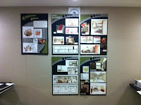

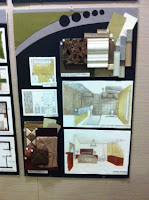
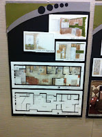
Progression Reflection: A Semester at a Glance
Throughout ID 205, I learned a lot about perspective drawings, Photoshop, InDesign, and communicating through design. I came into this class confident in my sketching abilities and with more constructive criticism and minor tricks for sketching, I was able to improve on sketching leading to it now being one of my strongest skills. As I have already been pretty good at graphic design when communicating through posters and layouts, I feel that this class has led to these skills being even stronger than they were before which has helped me in my other Interior Design classes to be able to not only layout a grid effectively but to also incorporate a single idea, simplify, or overpower throughout multiple displays tying them together. For example, with this assignment I am focusing more on the work that i have done throughout the semester so aside from sticking to a grid and following that grid throughout the posters, I am keeping the background and fonts very simplified as to not distract the viewer from what is supposed to be the focal points. Along with learning poster design, we learned the sketching and rendering skills needing to be in interior design. Though I was having a very hard time with the rendering at the beginning of the semester, I was able to learn the techniques of rendering on my own without the instructions in the book through exploration and practice. In the end, my growth in my rendering skills has improved tremendously and I would consider this a class success. When looking into my sketching abilities, I came into this class with much sketching experience and have taken other classes, learning the techniques of how to draw in perspective was very beneficial to my drawings. I had not learned the skills needed yet in order to use the horizon line and vanishing points in order to draw in a more true to the eye view. This will continue to help me throughout my schooling and career. having the ability to do so has helped with the assignments that are on this poster set. All in all I feel that my overall communication skill through design has improved tremendously.


