Friday, December 6, 2013

Design Firm Visit

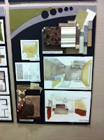
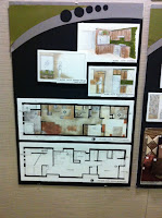
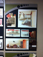
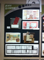
Over Thanksgiving break I met with Deanna Goguen of Decorum Design in Spokane, Washington. We discussed my project from ID 201 focusing on the design of an ADA accessible apartment for the Besse Family in Pullman, Washington with a second floor 1 bedroom income suite that is ADA visitable. In order to prepare for this visit, I made the model to my project, put together my process binder and had all of my inked drawings together in a folder to be viewed. I also brought a few material boards of the materials that were incorporated into my design.

Because I live far from any Interior Design firms, I stopped in Spokane on my way back to school in Pullman to meet with Deanna Goguen at her home office. When meeting with Deanna I was able to explain to her my project which had lasted all semester and the design solution that I came up with for the site. We talked about the problems of the site; that there is no light, it’s in downtown Pullman between businesses, the building area restrictions due to that, and the ADA requirements needing to be met. After explaining the problem, I presented the solution that I came up with in my design. I presented to Deanna the lower apartment floor plan, explaining how I met the ADA requirements along with the Besse Family’s needs. I then explained aesthetically how I designed the apartment aside from needs based on mobility and light, but expanding into the “idea of home” inspirational object of a first pet. With explaining the inspiration, I began with the concept exploration in the process binder and moved into the concept application in the design. After this, I was able to point out the display/presentation inking, renders, and drafting that I had done for the project as a whole.

When speaking with Deanna, I was given feedback that helped a lot for future projects. For the most part, she was very constructive yet not degrading and helped me to learn ways to improve a few drafting mishaps that I had made. She also explained to me the processes she will go through in the real world application asking me how I felt in the experience as well. The best advice that I was able to receive from her was that when I am applying the concept idea to my designs, to get it portrayed in three ways: the floor plan, a perspective, and a section view. This way, when someone is to look at the design in all, they will see an aspect of our inspiration in all views. When saying this though, she made it a point to not be too literal and to not overpower it. I thought that this was great advice. When meeting with Deanna, she complimented my rendering skills and said that I had done a really good job portraying not only the materials, but also in making the perspectives very believable for a client to view. She also liked how clean my drafting was done. I thought this was great to hear as it came from a professional. While meeting, Deanna asked me how I was planning to present my project during our presentations the following week, I began to explain that I was thinking to start with my concept and the “idea of home” and moving into the clients that we were building for, after that I stated that I would probably talk about the plan. At this point, she stopped me and explained that she would recommend that I don’t talk about the plan that way and to almost avoid speaking about the plan because it is something that all professionals know how to read and will not need explaining for. This was great advice, and when presenting I took it into consideration. In the end, Deanna complimented my work and said how I did an excellent job, ending with asking me what my favorite part was and where I felt that I had the most trouble. The answers being the redoing of a few inked drafts as the hardest parts as it is time consuming and it was such minor problems that I had done when I inked the first time. When explaining my favorite part, I said how it all has come together and seeing the model made in the end.

I had a really great time meeting with Deanna Goguen and felt that her feedback and professionalism was a very beneficial experience. I plan to keep in touch with her and hope to possibly this interaction will progress into continuous interactions for further projects.
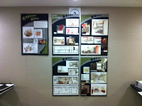
Progression Reflection: A Semester at a Glance


Throughout ID 205, I learned a lot about perspective drawings, Photoshop, InDesign, and communicating through design. I came into this class confident in my sketching abilities and with more constructive criticism and minor tricks for sketching, I was able to improve on sketching leading to it now being one of my strongest skills. As I have already been pretty good at graphic design when communicating through posters and layouts, I feel that this class has led to these skills being even stronger than they were before which has helped me in my other Interior Design classes to be able to not only layout a grid effectively but to also incorporate a single idea, simplify, or overpower throughout multiple displays tying them together. For example, with this assignment I am focusing more on the work that i have done throughout the semester so aside from sticking to a grid and following that grid throughout the posters, I am keeping the background and fonts very simplified as to not distract the viewer from what is supposed to be the focal points. Along with learning poster design, we learned the sketching and rendering skills needing to be in interior design. Though I was having a very hard time with the rendering at the beginning of the semester, I was able to learn the techniques of rendering on my own without the instructions in the book through exploration and practice. In the end, my growth in my rendering skills has improved tremendously and I would consider this a class success. When looking into my sketching abilities, I came into this class with much sketching experience and have taken other classes, learning the techniques of how to draw in perspective was very beneficial to my drawings. I had not learned the skills needed yet in order to use the horizon line and vanishing points in order to draw in a more true to the eye view. This will continue to help me throughout my schooling and career. having the ability to do so has helped with the assignments that are on this poster set. All in all I feel that my overall communication skill through design has improved tremendously.


Tuesday, October 22, 2013

Habitat for Humanity

This past Saturday I volunteered at the Palouse Habitat for Humanity. We worked on constructing a home in Albion, Washington which is geared for low income housing to support families transitions from temporary housing to permanent housing. Before going to the site I was very excited to work on the home as I have always been interested in construction because it is what my dad does for a living and I have helped him with small projects on and off.

While at the site, we worked on many different aspects of the construction. Starting with shoveling and moving dirt in order to level the ground outside the home to putting on hurricane ties and beginning the sheathing for the roof of the home and much more. I first worked with the shoveling and moving dirt which was a lot of core muscles I hadn't reached in awhile. Moving towards putting on the hurricane ties on the east side of the home. The hurricane ties are a structural component on a home to resist tension and basically hold the roof to the home in a way. Being in charge of nailing the hurricane ties in with the air pressure nail gun. I learned a lot about how a house is built from the bottom up rather than just seeing a home in the end and not actually understanding the process of how it was built. I had a lot of fun and would consider going back again another time.


Saturday, October 5, 2013

Sketch Crawl

When I saw everyone’s sketches at the sketch crawl I realized how different every person’s sketching strategies are. When it comes to adding color to each of our sketches, some did dramatic color and some so slim that it was barely an accent, yet with each tactic the sketches were still just as amazing. Sketching from my classmates and the Urban Sketchers were amazing and interesting to see the differences throughout. My strengths with sketching are my perspectives and being able to see the spaces put to paper, my weakness however, is adding color. I usually have a hard time adding color to my sketches because it either becomes overwhelming or I end up not liking it as much as when it was just ink. In sketches since the Sketch Crawl (and at the sketch crawl) I have tried to use color more subtly in order to accent color but without accidentally overwhelming and ruining my sketches. I plan to continue to do this and to eventually add more color and try different medias with time. Being able to experience the sketch crawl was very interesting and fun. I look forward to continuing to sketch on and off whenever I travel from now on as an inspiration from the Urban Sketchers.

My First Interior Design Job Shadow

My job shadow was to Callison in Seattle, Washington. At my job shadow, I toured the vicinity and was able to see all of the different teams within the company. Seeing the different aspects of the job and the different responsibilities of each team was very interesting. Each team will have a different project, but within those teams, the members may help other teams with their projects when they don’t have one of their own. The aspect of teamwork throughout the business was relieving in a way to know that even with it being separated, they will come together as one in the end. When I think about my future, I can really see myself working for Callison and doing the retail design that they prominently do. I really liked the design aspect of working with retail and having to know how people interact with space and the lighting of the space in order to sell the products of that business. The way Callison works to get their designs is a way that I am very familiar with and comfortable with. The concept development systems and bubble diagrams, along with sketches, are all aspects of design that I feel confident and comfortable doing. The fact that Callison strictly pulls ideas with concept development rather than skipping that step which is important to me and really drew me in to this firm. Having the opportunity to job shadow at Callison was one of the best experiences I’ve had the chance to encounter and I am extremely thankful because it really helped me to understand the real world encounter of an Interior Designer as well as what I can expect in the future. Being at Callison was my favorite part of the Seattle trip and I am very thankful I got the opportunity. I can definitely see myself with a job there in the future.

Frye Art Museum

The Frye Art Museum in Seattle, Washington was a beautiful and interesting museum where the entry was reconstructed to make sure that the person experiencing the space had a full encounter and interest in the entrance experience. With the ramp entry way and the waterfall and reflection pool next to it, it is a space which people of all mobility standards can experience and view. The reflection of the natural day light on the water at the outside entrance is an amazing sight which in my opinion intrigues a guest causing them to want to enter the museum. Within the entry was a dome much like a temple in the past. The top is a perfect half sphere which lets light reflect and opens the space up to experience it in a different way. Throughout the museum, light is of an importance because it puts emphasis on each piece of artwork but without damage to the pieces of art as well as the natural light coming in from the ceiling of the museum throughout the space which accents the art without reaching all the way to the art pieces to cause any light damage. When designing for a museum, you must be very conscious of the light because it is needed to see the art and emphasize it subtly however, it cannot be direct or damaging. Also with designing a museum, you have to lay out the space to be an easy flow of traffic with a lot of space corresponding to art works within the building. All in all, I loved the Frye Art Museum and the way that they used light so subtly through the skylights.

Chapel of St. Ignatius, Seattle University

The Chapel of St. Ignatius of Seattle University was profoundly impacting when walking through the doors. Not only is it a place of worship and faith, but it is a beautiful work of design. The use of light and texture throughout the space pulls one in and almost takes over in a way. The design is based on six bottles of light in a way and with the different colors streaming in in various places, it pulls a viewer in to feel it’s true beauty. Throughout a day, the light will reflect in different ways causing you to view the chapel in a difference sense each time. When the light hits the walls in a different way throughout, it causes the textured walls to be viewed a little differently each time giving it a different impact on the viewer each time. Since it is a place of worship, a designer must consider the different ways a person may experience the space around them. That being said, you must adjust for there to be worship, praise, comfort, and much more in the space and design around that in order to accommodate to each person’s need. I feel that this specific space works very well for the purpose and with the design inspiration. I thought that the Chapel of St. Ignatius was compelling and absolutely beautiful.

Street Bean Espresso and Shelter

When I visited the Street Bean Espresso and Shelter, I had a rude awakening for what is out there and what I don’t usually see on a daily basis. Being from such a small town, the idea of having a shelter in the town is unheard of and hearing how common it is in Seattle was pretty striking. When we entered the shelter, I got to see a sense of “home” from a different perspective. Home can mean so many different things to different people and seeing this place as a temporary but profound home to those that need it, was a pretty emotional encounter for me. When you are dealing with a large population like the streets of Seattle, you have to accommodate for the possibility of many residents in the shelter. Being a space for numerous people, you must accommodate to the idea that not everyone has the same tastes, level of comfort, or idea of “home” and with that being said, you must have versatile areas throughout a space in order to comfort the varying personalities to those staying there. Knowing this, as a designer for a residential space, I have to be able to accommodate each client with a space which they feel comfortable in. I really liked that they accommodated in a comfortable fashion, a place for some of their attendees to work across the street and to socialize. It’s almost as if they gave them a home away from home, where they can get away. This is a good idea to keep in mind when designing commercially (like the café).

Westlake Residence

In Seattle, there are many apartments going up all the time and sometimes with not enough ground area to build upon they must find a way to work around it. In order to build multiple apartments within such a small footage plan, Graham Baba Architects had to build up rather than out at the Westlake Residence construction site that we toured. Within each space separated for a studio apartment, they made a lofted 2nd floor in order to give a larger square footage to each individual apartment plan. With such a large population in Seattle, the ability to put so many apartments into a smaller acreage of land is a good ability. The most advantageous part of touring the Westlake Residence for me and my studies, were learning ways to think about smart use of space. Seeing how the designers of the Westlake project fit so many amenities into the small spaces has taught me ways to think of my current apartment design and how to fit so much into the small space. When designing for residential spaces, you must consider the space that you are working with and the wants and needs for that client. Doing so will help me as a designer, to accommodate the client but also to use the space that I am working with efficiently.

zHomes - Seattle, Washington

After visiting the zHome projects in Issaquah, Washington, I learned a lot more about environmental and energy smart design that I didn’t know about beforehand. I don’t think that I really thought much about the importance of the environmental and energy saving designs in spaces before but I now realize the importance of it. When it comes to my own designing of residential spaces, I will now be able to keep in mind the different ways I can implement energy efficient products and materials. I particularly thought that the heat recovery ventilator was very interesting in the ways that it saves money and time for the home owner. As a designer, I really like the idea of being able to heat the air as it comes into the building with the passing of the exiting air. This is something that when possible, I will implicate into my designs to make for better efficiency. Along with the heat recovery ventilator, having ground source heat and solar panels are also beneficial to a residential environment. Learning about the zHome ideas has helped me in opening my mind up for different ideas and options in design.

Friday, September 13, 2013

Ride, Don't Walk: A Wheel Chair Experience

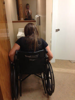
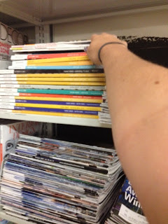
              My partner and I rode in a wheel chair throughout two school buildings and in between as a way to "take a step into someone else’s world" kind of like taking a walk in someone else's shoes, in order to see how a person in a wheel chair views the world and how a person with mobility challenges is accommodated in the environment. In my experience, I was asked to retrieve and/or experience every day encounters such as retrieving a magazine from the middle of a book shelf, order and receive a coffee from a coffee shop (in my case the shop was closed but I went through the motions anyway), and to attempt a use at the bathroom, elevator, and just everyday navigation. I came to find out that using a wheel chair is much harder than I had suspected, I used many muscles that I hadn’t known existed. I realized how much even the slightest incline or decline in ground effects how you get around, and I learned that the accommodations for those in a wheel chair are not very convenient nor common – making life in a wheel chair much more challenging than I had ever realized.
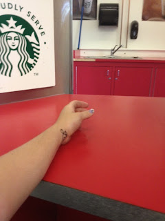
              When it comes to the designed environment accommodated people with different needs, for the most part it is to the average person that it is accompanying. Ordering counters are too high for those in a wheelchair, however, it’s not so high that you can’t work with it it’s just a huge inconvenience. As with the standard door widths throughout most buildings, they work for those in or not in a wheel chair, but are a little snug for those in a wheel chair. If it were affordable, I think that the designed environment should be accessible to everyone in a way that is not an inconvenience to those without mobility challenges, yet still allowing for easy accessibility for those who are.
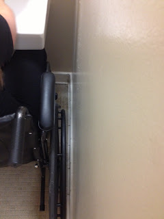
             In my experience, I noticed that there were many places which were said to be “Handicap Accessible”, yet when encountering those spaces it seemed very troublesome. For example, entering into Daggy Hall on campus on the ground level was difficult because the handicap accessible door opening button was not working making opening the door myself very hard, as well as the ramp right inside the door was at such a steep grade that I rolled very fast down it and found it hard to stop myself. Also in the same hall, the bathroom which specified that it were a handicap accessible one was very difficult to use. There were railings in the slightly larger room which suggested use for someone with challenged mobility, however the stall was not nearly large enough to maneuver a wheel chair, nor was the bathroom as a whole large enough to get in and out and wash your hands. This made the whole experience a large eye opener because I had never really thought about the inconveniences that those with mobility challenges face on a daily basis.

Photo 1- This is the handicap accessible bathroom which shows how snug of a space you are in
Photo 2- This is the wheel of the wheel chair tight up to the wall in the sink area
Photo 3- This is the counter where you pick up your drink at the cafe which is very high
Photo 4- This is the view point from a wheel chair when ordering a drink at the coffee stand from a barista
Photo 5- This is me reaching for a magazine on the middle shelf of the book shelf and my view point from a wheel chair

Monday, August 26, 2013

What is Home?


To me, a home is a place where you can run to and feel comfortable no matter the circumstances; a place where you feel welcomed and wanted when you walk in the doors. Home is where you can be your crazy, obnoxious, or quiet self and not feel judged or ridiculed for doing so. A home should represent who you are, who your family is, and what your values are. It shouldn’t be a misrepresentation of you or your family, but rather a symbol of who you are. A home will usually portray certain values in which your family or self believe and cherish. I am a firm believer that you know a home from the feeling that you get when walking in the doors. It’s hard to describe, but that feeling of warmth, comfort, relaxation, and bittersweet happiness that overcomes you when you walk into the room.
                My personal relation to “home” comes down to a yellow house that I lived in from age seven to eleven. This house is only one of many that I grew up in, but the memories and the visuals of this house are the most prominent. I moved pretty often as a kid, from rental to rental (not town to town) about every 3-5 years. This lead me to not really have one particular home for my childhood. Since I was twelve, I have lived in the same home however, most of my memories of what a home is and my best home memories resort back to the yellow house that I lived in for five years.
                This house had a very big yard with every fruit tree you can think of (well ones that are in Washington) and even an almond tree. We had a bonfire pit, a teatherball pole, and so much more. It was a place that I remember most as a child and a place that, to this day, I wish my parents had bought while we had the chance. I have had many homes, but when I look back, this yellow house is the most prominent and is my home.
                Though I have lived in many homes and had many different experiences, my best relations to home are my dog copper who passed away recently, eating mini wheats and cocoa puffs, and whenever I see Scooby doo on the television. Home is dear to my heart, and these few memories and items will always stick with me.  

Friday, July 26, 2013

Seat and Shelter

This was a presentation done showing 2d to 3d development and a final 3D model of a seat and shelter design. Throughout this process, I worked from the Art Deco inspiration and chose to stick within the geometric design of the time period. With the multiple chevron designs throughout most Art Deco pieces that I saw, I chose a Pinecone as an inspiratinoal object. This pinecones shape and repetitive design represent Art Deco in my eyes. I worked from an inanimate object to 2D abstractions (in an earlier post) to 3D models (also another previous post) and then came to the design of this seat and shelter. I learned a lot in this process about abstraction and time management. Along with what I tend to lean towards design aesthetically. I feel that I successfully built a seat and shelter from my inspiration without pulling directly and obviously from it. Hope you like it as well.

Thursday, July 11, 2013

SketchBook

These are some sketches out of my sketchbook. The first sketch is my very first sketch of a 1 point perspective drawing and the second is my second one. The first one was done in the education annex on campus and the second at the campus library. For never intentionally doing a perspective sketch of the interior of a building, I was very proud of myself for how well that I did. The third sketch was a contour lines excersize, where I practiced quick undetailed outlines of people. I found it difficult to do this without wanting to constantly improve the people, or to not do so well at teh perportions of their legs (hence why some have no bottom halves). The fourth sketch was done in order to practice sketching the negative space in order to form an object. The fifth sketch is actually a layout of my friends apartment (which I was staying in at the time) on a napkin. Being a designer, sometimes knowing how to draw on a napkin effectively can come in handy. This was my first layout and perspective drawn freehand. I found the perspective and scaling hard to do at this time, but have improved since. The sixth sketch was done as a shade and shadow excersize in order to see how light effects an object and the shadows casted. I had a hard time with finding a good stairway that wasn't too shaded and not too overcast, however I feel confident that I know understand the concept. Sketch number seven was a 5 perspective view sketch of a chair which I chose a chair in the classroom that I found the material interesting on. This came easy to me, as I have sketched little peices of furniture around my house for years. Number eight was a watercolor and contour line still life, which was intended to be a quick study. I felt confident in this as I am more confident with paints than ink. Sketches nine and ten were done of the same area on campus in order to show two different media of the same shade and shadow. I feel that I look more confident in the graphite, however when doing these sketches I actually had a harder time with the graphite as I felt that I was smearing it too much. Sketch number eleven was a 1 pt perspective of an exterior building which required color for emphasis. This made this sketch extremely hard for me (and probably my least liked sketch in my opinion) because I am not confident in colored pencils and cannot quite figure out how to utilize them effectively. This is a goal of mine to work on in the near future. Number twelve is an interior 2 pt perspective of my living room. Before this sketch I didn't exactly know what a two point perspective was. However, it didn't seem too challenging as I understood the concept and utilized the skills learned beforehand. The final sketch was an exterior two point perspective of the education annex on campus (the interior is sketch number 1) and though my shading is a little dull, I am confident and proud of this sketch.
With these sketches and the process of growing and learning througout it, I feel that I highly strengthened my skills and hand weight on lines. I do think that I can improve in my shading style and comparing sketch 9 and 13 can show the range that I tend to use along with my "scratch" like style. My sketch journey was a fairly fun process and easy for me due to my familiarity with sketching in the past, however I do think that I improved tremendously still and that I can continue improving and practicing this skill.